Background
Cannabis retail operates at a pace that most software wasn't built for. Tymber set out to change that — building a platform that could handle everything from staff login and role management to multi-store operations and compliance-driven settings. Our role was to take a product with serious bones and give it the design foundation it deserved.
Challenge
As Tymber scaled, the product hadn't grown with it. New features had been added reactively — each one solving an immediate problem, but none of them speaking the same visual or structural language. The result was a platform that asked too much of the people using it.
Authentication alone told the story: users could log in with an email or a phone number, switch between multiple store locations, and reset passwords — but each of those flows felt like a different product. On tablet and mobile, where budtenders actually live during a shift, the experience broke down further.
Beyond the surface, the deeper issue was structural: no shared component language, no responsive system, and no consistent logic governing how information was organized or how permissions were communicated. The ask was clear — unify the platform, build it to scale, and make sure it works for the person standing behind a counter at 6pm on a Friday.
Approach
We started where the product started — the login screen — and worked outward from there. Before touching any feature, we ran a full audit of every existing surface: inputs, buttons, table rows, tags, dropdowns, modals, and navigation patterns.
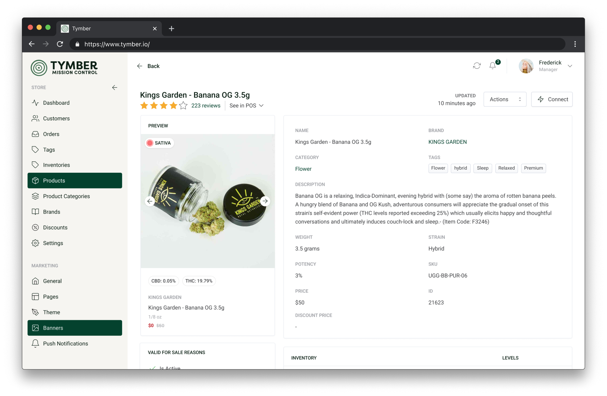
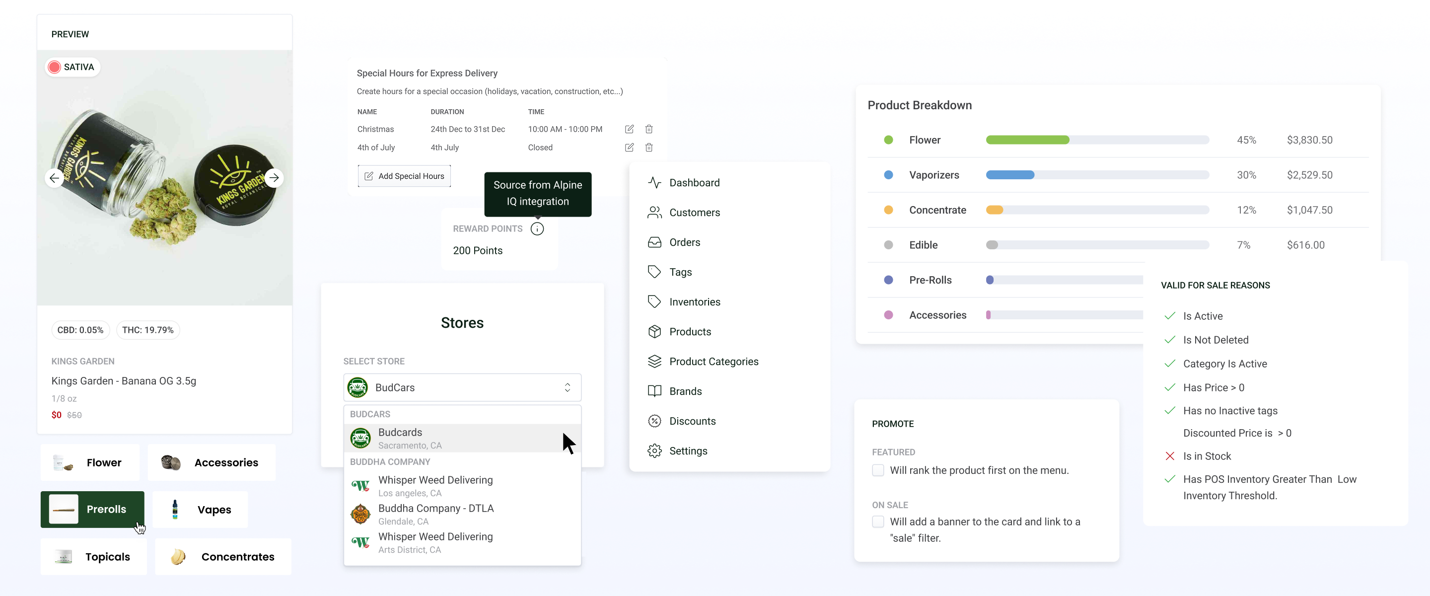
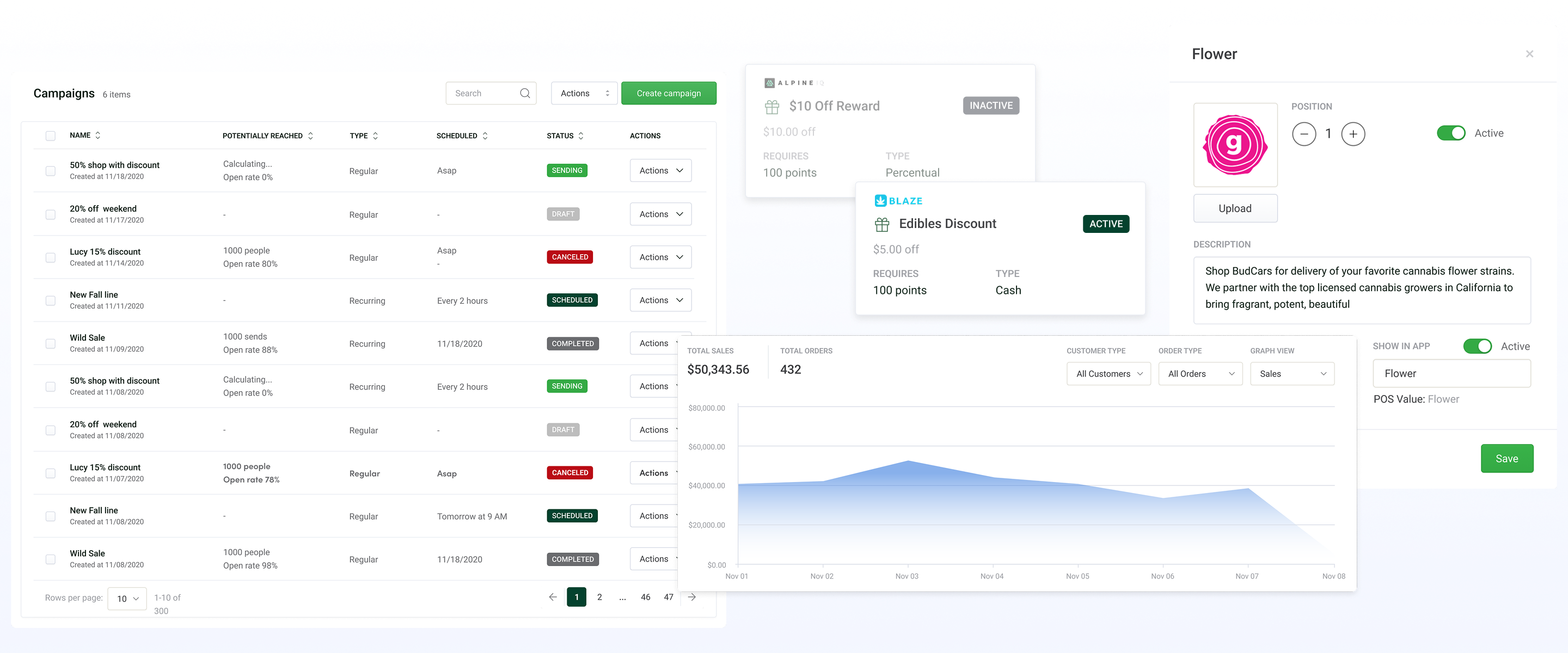
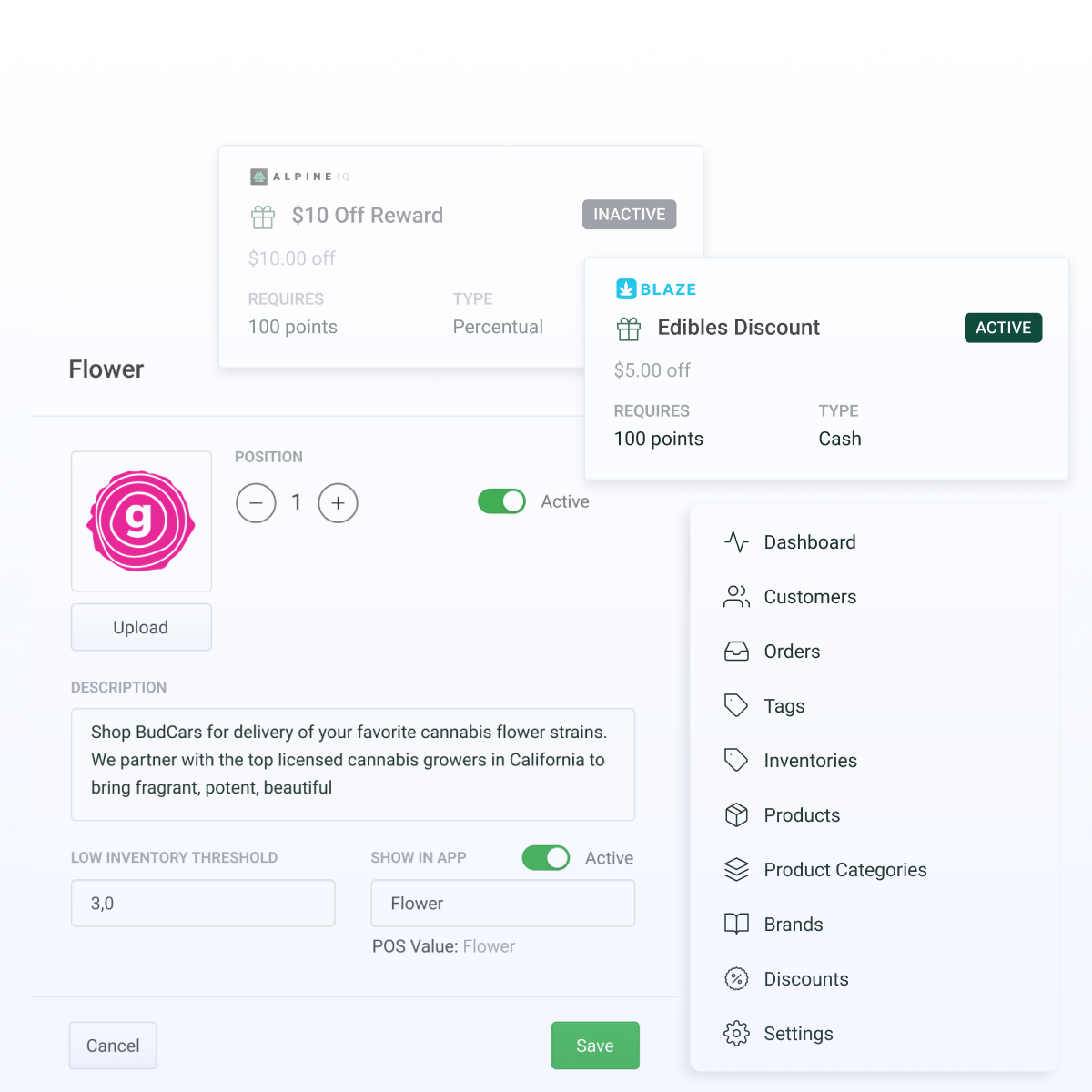
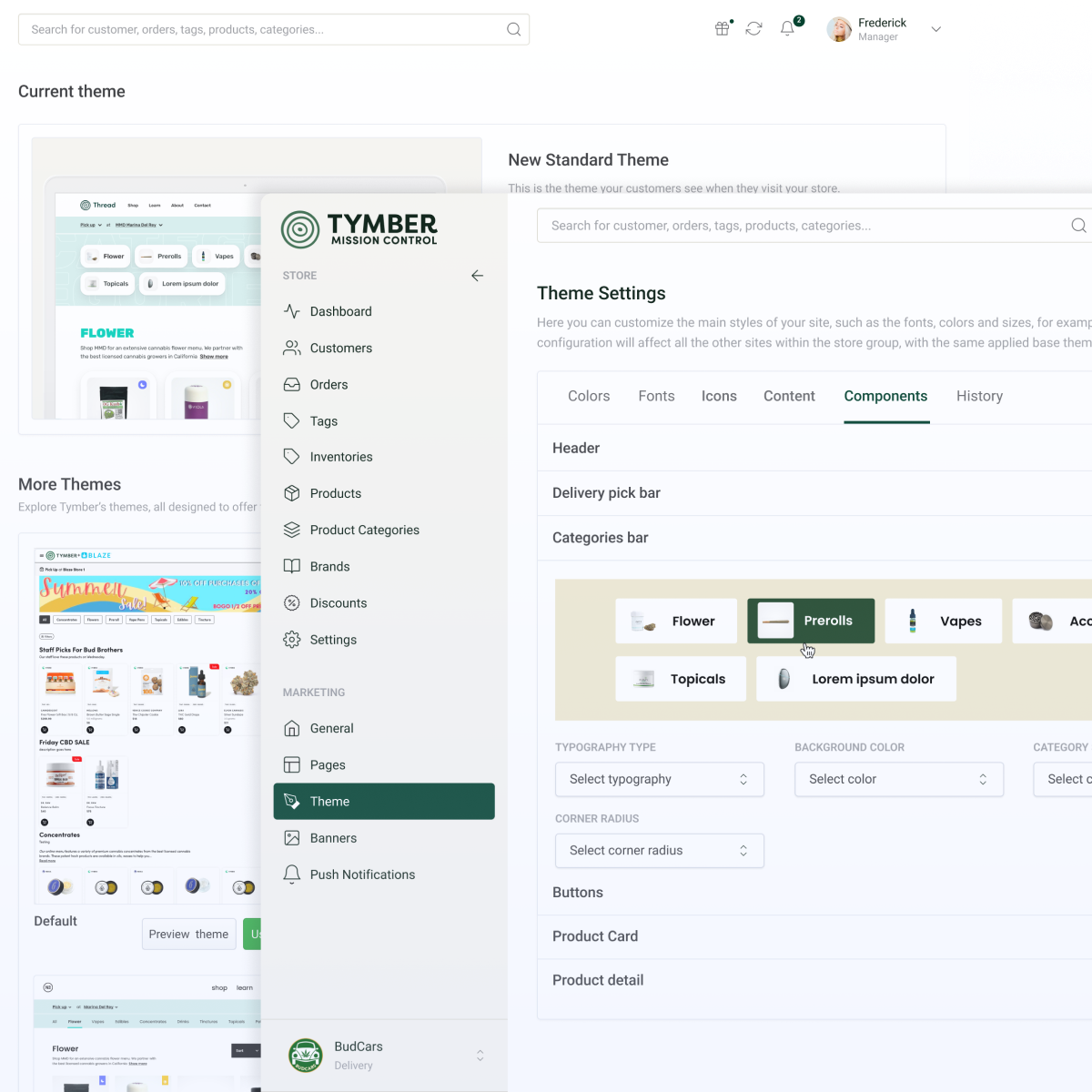
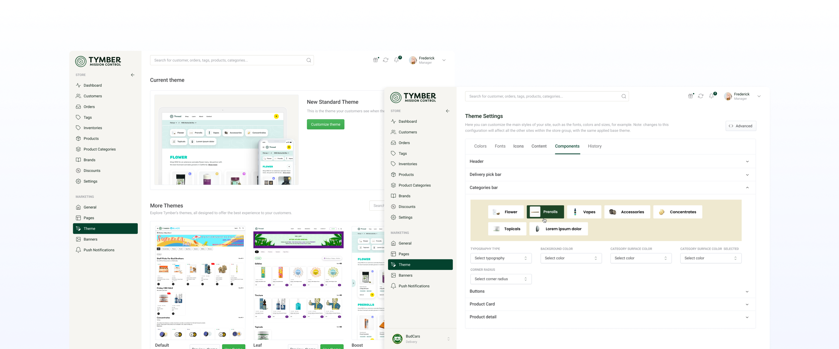
From that audit, we built a design system from the atom up — each component defined once, documented clearly, and built to flex across three breakpoints. With the system in place, we redesigned the full authentication flow as a single coherent experience, then turned to the operational core: team management and store settings, rebuilt as a permission-aware, role-driven interface.
Throughout, we designed with role in mind. A budtender's screen should never feel like an admin dashboard. An enterprise operator shouldn't have to dig for what they need. The same platform serves both — by surfacing the right things to the right people.
The result
Tymber's team came out of the process with something they hadn't had before: a product that behaves like a product — not a collection of features, but a system. Task completion time dropped significantly in usability testing, with users moving through authentication and team management flows with far less hesitation.
For the engineering team, the design system changed the pace of work entirely — components documented, responsive behavior defined, logic consistent. And for the people on the floor — the budtenders, the shift managers, the store leads — the platform finally felt like it was designed for them.